Browse the catalogue Tribal Portraits: Vintage and Contemporary Photographs from the African Continent, Bernard J Shapero Rare Books. Core resources: TribalPortraits.pdf
Write a brief reflective commentary in your learning log. (Open College of the Arts, 2014:96)
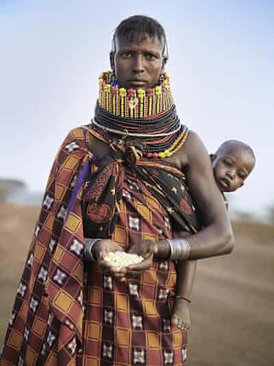
Tribal Portraits Vintage and contemporary photographs from the African continent, a catalogue from a sale of photographs in 2008 by Bernard J Shapero; the images were taken from 1856 to 2008 and the text states that is presents the images as art.
The cover image is full of promise, offering a different perspective. However from that starting point most of the images are stereotypical portraits of African people. Mostly the women are presented a full frontals, naked from at least the waist up and the images ae predominantly women. Vincenti’s late 19th century images of men are one of the few exceptions. I was surprised to see Lehnert and Landrock African women photographed in obvious western style poses, but accept that these have their place in the history of tribal photography.
Its unfortunate that the images aren’t presented chronologically, as there is no progression or logic in the presentation. Contemporary photographers Malick Sidibe and Seydou Keita present a welcome relief to the stereotypical earlier photographs; but to call this a mixture of contemporary and historical tribal photography is misleading as most of the images are from 1856 to the 1950s and there are only a handful of 21st century images such as Graff’s and comparatively few late 20th century images.
I also take issue with some of the captions such as item 9 Portrait study billed as an “unusual informal grouping” when in fact the women are they are sitting on western chairs and have obviously been arranged to a degree.
My favourite image is item 18 by Riefenstahl, the Nuba Dancers of Kau (1975); it is full of life and skilfully captures a vibrant and realistic picture, the nudity appears as natural as obviously was, there is context and it is unposed. Ricciardi’s images of the late 1960s in Kenya also have welcome life to them.
My conclusions, that there is obvious documentary value in the collection but we could learn more easily from the catalogue if the images were present chronologically or by region or even with more context; if presented in the former way we would at least be able to ascertain if there has been any progression in the photography. I guess the motivation was simply to sell the images and I should not wish for anything beyond that; it is however a good source of tribal photographs.
References:
Open College of the Arts (2014) Photography 2: Documentary-Fact and Fiction (Course Manual). Barnsley: Open College of the Arts.
Read the two essays in the BPB 2008 programme and look at the work the curator selected for the exhibition.Core resources: BPB2008.pdf
Write a short press release of around 250 words in your learning log – in your own words. (Open College of the Arts, 2014:94)
Press release
Memory of Fire: The war of images and images of war. Curated by Julian Stallabrass. 3.10.08-16.11.08. Brighton Photo Biennial 2008
Through 10 curated exhibitions from across the South East, including work from the first World War pictures of Frank Hurley to the aestheticised, often depopulated aftermath war landscapes of Norfolk, Seawright and Ristelhueber, guest curator Julian Stallabrass presents us with images to reflect on. Bringing together coverage additionally from the Vietnam to the current wars in Iraq and Afghanistan, the material invites us to explore the approaches to photographing war, sharing images of war and their effects.
The biennial aims to provoke thinking about war images and the role that photojournalism plays in the media and democratic politics. As Sarah James points out “ the relationship between war and photography mirrors that crisis of representation synonymous with modern times”. Amongst the themes explored are the changing relationship between military strategy, the conduct of war, the media, and its associated technology. The variety of photographs, photojournalists as well as their period and chosen environments, cause us to acknowledge topics such as journalist embedding, staging for cameras, rapid publishing, post camera manipulation and their effects on the quality of media images. Another perspective is presented by the non-western mobile phone images and Iraqi journalist Ghaith Abdul-Ahad.
As viewers may not see all of the exhibitions, Stallabrass shares the direction and messages in the works in the free Biennial programme guide, retrospective book and the 2008 website.
What would you have done had you been the editor of a British broadsheet newspaper?
A similar case revolving around a photograph of a dead Iraqi soldier in the Gulf War prompted Michael Ignatieff, the author of Magnum Degrees, to write and reflect on the ethics of photojournalism. Read ‘But Should You Print It?’Core resources: ShouldYouPrint.pdf (Open College of the Arts, 2014:89)
My response
Cozen’s article was a response to the various ways that a media photograph, by photographer Guerrero, for a Spanish newspaper of the Madrid train bombing was published; the controversy was about a severed limb which appeared in the original image. The British newspapers airbrushed, replaced with background stones or disguised it by bleeding the colour out; the Spanish newspaper published the image as taken.
Reuters say that they don’t like removals from photographs or anything that changes the editorial content. The Telegraph’s picture editor said it was a question of taste, removing the body part didn’t change the context and it didn’t add anything to the picture.
Michael Ignatieff in his paper “But Should You Print It?, mentions four areas of sensitivity:
Faking: the manipulation, which can’t be detected.
Decency: which is declining
Privacy: whether it’s is a public occasion seems to be the crux of this
Violence: would the presence of the camera invite violence?
Ignatief suggests we ask 4 questions and that 1 of them must be affirmed:
Is the event of such significance that the shock is worth it?
Is the objectionable detail necessary for a proper understanding of the event?
Does the subject freely consent?
Does the image express humanity?
He points out that despite all the wars we have seen and experienced “popular culture is still largely imbued with a romantic conception of war and resents a grimmer reality” (Ignatieff,nd).
The code of ethics (National Press Photographers Association, 2017) states that “our primary role is to report visually on the significant event and varied viewpoints in our common world….the faithful and comprehensive depiction of the subject at hand”. In the detail it states that images should be accurate, unmanipulated, have context and shot with respect.
Having reflected on this my response would be to print the photograph I its entirety; as if you begin to manipulate images even to be sensitive, where do you draw the line; how much manipulation is ethical/correct? However from what I read in Cozen’s article it seems that the experience of the British papers is such that there would have been many complaints if the severed limb had been evident; as a British Newspaper I guess I would have stayed with the rest of the pack.
Read the, WeAreOCA blog post The ethics of aesthetics, (http://www.weareoca.com/photography/the-ethics-of-aesthetics/) including all the replies to it, and write a comment both on the blog page and in your blog. Make sure that you visit all the links on the blog post. (Open College of the Arts, 2014:88)
Rankin visited Turkana, Kenya for Oxfam’s Blog Action Day to meet some of the people facing drought and hunger in a region that has not had enough rain since 2005.
Rankin photographs famine in east Africa (2011)
He also worked with Oxfam in the war torn provinces of the democratic republic of Congo, where he choose to photograph them against a white background out of their environment to focus on their expressions, humanity.
Rankin in Congo: ‘Their humanity was what I wanted people to notice’ (2021)
Chaskielberg’s photographs for Oxfam in the Horn of Africa were all taken in the moonlight with added flash lighting and have as has become his trademark style. It’s interesting that Oxfam itself ran an article titled “Alejandro Chaskielberg’s moonlight photos: Too beautiful”. Oxfam finds them memorable and distinctive but that not all agree with this. Chaskielberg himself suggests that his subjects may look stiff and detached because they have to hold their pose for a time. Some felt the pictures were too beautiful for their situations; however Chaskielberg would like to break the idea that an aesthetic image detracts from its message.
Elisabeth and her eight children live in the village of Natoo in Northern Turkana near Lokitaung. Elisabeth’s husband died from sickness, leaving her soley responsible for bringing up her children.
“I appreciate pastoralism but animals are not sustainable anymore. When there is drought your animals die and you are left with nothing. If I could make one thing happen it would be to have my own business and earn money.” says Elisabeth
Women pose for a photograph by Alejandro Chaskielberg in their gardens.
(Kramer, 2021)
We are also referred to Mraz’s comments relating to Sebastiao Salgado. Mraz that a documentary photograph should strive to achieve a balance between expression and information. The blog author says that if that balance is not right then the effectiveness of a photograph for visually sharing information is changed. He gives an example of an effective combination of the two as Tom Stoddard’s image of an emaciated woman in Ajiep, Sudan which he describes as a document and a symbol, “specific to the events it refers to and universal”, here I can see the ethics and the aesthetics of the image are working together.
AJIEP, SUDAN-JULY 1998: The emaciated legs of a girl at Ajiep, southern Sudan, during the famine of 1998. (Photo By Tom Stoddart/Getty Images)
I agree with Rob Harris (31.10.20) who asks the point in reading 70 odd blog post responses, as they become repetitive. This is my response to the original post rather than reactions to other’s posts. Although I appreciate the aesthetics in Chaskielberg’s images and they make a refreshing change, I feel they have the appearance of studio shots, seem theatrical and staged and lack authenticity as images that are to portray people experiencing hunger and drought.
I can relate much better to Rankin’s images, where the people look real, dignified, not distressed but taut, and the food in their cupped hands brings us back to the reason for the image. Rankin also wanted his portraits to do something different, as he felt the stereotypical images of disaster zones have produced anesthetised audiences; in his Congo images that he wanted to depict their humanity and I believe he has done this.
I have to ask myself have become too used to more direct images like Tom Stoppard’s representing famine, and is this why I find Chasleilberg’s images too beautiful? Possibly. However if I was using images to provoke interest in fundraising and action I would use Rankin’s more realistic but dignified images as a fresh alternative to the more traditional Tom Stoddard famine images. I don’t believe Chaskielberg’s images will for most convey the necessary message.
This research project in 2005 called for a debate and reconsideration of the power and purpose of disaster pictures. It highlighted issues that persisted in images of famine:
Stereotypical images of victims, that raise money but with short term benefits and long term disadvantage of embedding cultural and racial stereotypes?
Do negative images breed the sense that nothing can be done or are they necessary for fundraising?
Could positive images of people in need be presented?
Is an image negative if it produces a positive outcome?
Would such images be appropriate if they minimised the scale of suffering?
What is the purpose of text/captions?
Can photographers provide images with context, understanding and explanation?
Are foreign disasters only important if they are on a massive scale?
Is there compassion fatigue or do hard hitting images force governments to act?
Does immediacy enabled by technology cause simplified rather than impactful compositions?
Can one picture share a good understanding of issues?
Are photographers simply image makers or do they have wider responsibilities?
Does the ends justify the means?
My response:
I began by looking at Aid Agency online posting. Oxfam International currently mainly uses positive single images with some smiling faces and a lot of context for its famine pages. They are certainly shot with respect, are not stereotypical and provide plenty of explanation.
Hunger crisis in South Sudan, 2020)
(Crisis in Democratic Republic of Congo, 2020)
(The fight against hunger must top the EU agenda for a fair and green recovery, 2020)
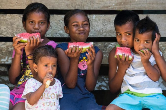
Feed the Children charity uses few images and those used are simply children’s smiling faces. UNICEF favours videos on its web site and where there are single images they are positive images such as the one below which is saying “look what we can achieve”:
Children eating watermelon and other fresh fruits in Lungga, East Honiara, Solomon Islands;
(Protecting Rohingya children in Bangladesh,2018)
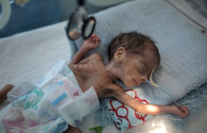
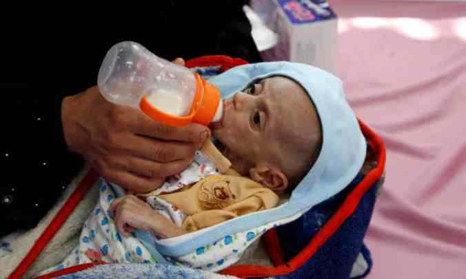
The tone of the images changed completely when I began to access media images of current stories; of which there were surprisingly few currently. In the Independent I found two recent articles about the hunger in Yemen. I was shocked that the first 2 articles I accessed used shocking images of babies with malnutrition in incubators. I am sharing one of these only as a contrast to the image used by UNICEF on the same topic:
The independent image (Via AP news wire, 2020)
The UNICEF image Nutrition and life-saving food (2021)
These two images also highlight the effect lack of control over the publishing of information is also the Independent image above was added by the Independent to an article about the launch by UNICEF of its Yemen appeal. This would surely not have been UNICEF choice of image for the story.
I did find some more positive, dignified and effect based images in the media, published with good context:
Via AP news wire (2020)
Ahmed, K. (2020)
The BBC seems to use more videos than still images and I was surprised that there has been little recent coverage.
The paper Famine imaging by David Campany raised questions about ‘compassion fatigue’, iconic and stereotypical images, and the use of photographs for fundraising. From my current research it is obvious that different media use contrasting types of images to suit their consumers. Aid agencies are more respectful to their subjects and are keen to highlight the benefits of their projects particularly longer term. The images that I have found are less stereotypical than they were shown to be in the research paper of 2005, which is as you would expect, so approaches have moved on since that time. Whether this is because they have found that stereotypes have become less effective in raising aid and sympathy, or whether this is simply a response to increased ethics in photography and publishing I don’t know. I would assume that aid agencies have identified that it is not necessary to be forceful visually about the scale of suffering, as they can provide this in their accompanying text explanations.
Read the articles ‘Walk the Line’ by Max Houghton (Foto8, issue 23, pp.143–4) and ‘Imaging War’ by Jonathan Kaplan (Foto8, issue 23, pp.142–3).Core resources: Foto8#23_Kaplan&Houghton.pdf
Write down your reactions to the authors’ arguments. (Open College of the Arts, 2014:86)
My reaction to their arguments:
Kaplin has been a doctor and surgeon in hospitals and battlefields across the world as well as an author and photographer. He relates the learning of photojournalism to that of transforming from a doctor to a surgeon, after some learning from studying eventually you have to immerse yourself in the practice of it; this is something he is in a position to do but I feel that a medical professional will have more training and preparation for the later experiences than a photojournalist and it more likely to be shocked by what they encounter in the field. In exploring what kind of images of the human body are suitable for publication he concludes that this is whatever persist at the time of publication, though he says that you can be too close to a subject.
Houghton is a MA course leader in Photojournalism and documentary. Whilst picture editors have to grapple with which images are suitable for publishing, according to taste and ethics, she points out that taste and ethics are personal, just as are where we set our boundaries. She quotes Sophie Batterbury, the picture editor of the Independent on Sunday, who believes that the goriest images aren’t the best at telling the story as the gore detracts from the emotion of the picture. Houghton conversely mentions Greg Whitmore picture editor of the Observer who used a graphic picture in black and white that was then reproduced in colour in the Telegraph in colour; he justified the use of the image partly because his first publishing inspired the observer journalist to investigate the story further. This investigation meant that the image was then combined with a narrative of the event. I’m surprised that there was only one complaint received about the image. Apparently the Observer draws the line at publishing images of severed heads, although there was a reason that this line was nearly stepped over recently so it is not sacrosanct. Houghton illustrates that when Kaplin was asked to contribute images to a book on the effects of landmines and their clearing, Kaplin then agreed when the images were dropped. The images were dropped as it was thought they might be off putting to buyers/readers and then value of the rest of the publication might then be missed; this points out that boundaries appear for different reasons – this was a commercial not ethical decision. Houghton explains that he was shocked when the decapitated heads of “Uday and Qusay” were displayed as trophies, in the Guardian 2003, which indicates that there is a line for him. He shares the various reactions at a conference to disturbing conflict images such as the “falling Man” and Luc Delahaye’s “Dead Taliban solider”; issues of respect for their families were raised but again the responses were personal.
Reading these articles raises issues such as:
How far should we go with publishing images of war and disasters?
What images are suitable?
What criteria should be used?
Are there any lines to be crossed?
Are feelings and emotions important?
Are the answers defined by ethic, commerce, respect for individuals or their families, politics, relationships between media companies and governments, or are they simply personal?
I am in the position that I can form and operate with my own standards but I acknowledge that it is hard for photographers/editors/publishers to set a line that is appropriate. No one person has control over the way images will be shared, but ultimately it is the photographer who must be mindful of the way the images may by used, and at the time of shooting I believe should act respectfully. Ultimately whether an image should be used or not I think comes down to whether using the image adds impact to the story, for me assuming it has been obtained ethically and respectfully. Reading these articles has brought more questions for me that answers at this stage, but will make me more reflective as I read and view such articles and images from hereon.
References:
Houghton,M. (2008) “Walk the Line” In: Foto8 (23) Spring/summer pp133-134
Listen to Don McCullin talking about his exhibition Shaped by War on Radio 4’s Excess Baggage:www.bbc.co.uk/radio/player/b00qlgzg (Open College of the Arts, 2014:86)
McCullin is clear that the purpose of the war photograph is to enlighten the viewer who aren’t there what war is like.
When asked about the title of the exhibition “Shaped by war”, what effect has war had on you as a person? He answered that he wanted the photos to create a response; though he feels that the fact that he has to talk so much about his photos is slightly defeating as the images should be talking for themselves and if viewers need supplementing what, where, why, the what was their purpose?
In retrospect he realised that war photos should be about civilian suffering as they are those that are done unto.
McCullin says wanted to be the voice of the people in these images, and sees the images as a window into other peoples lives, a form of communication. He sounds weary in the interview and it is clear that he is still very affected by his experiences and that is still suffering close to his mind whatever he is photographing now.
He believes that he gave his subjects some dignity by photographing alone
He notes that you need a reflective attitude towards the suffering you portray, a knowledge and personal investment, though the goriest images don’t necessarily tell a story well.
References:
Open College of the Arts (2014) Photography 2: Documentary-Fact and Fiction (Course Manual). Barnsley: Open College of the Arts.
Read the article ‘The Photograph as an Intersection of Gazes: The Example of National Geographic’ by Catherine Lutz and Jane Collins. Core resources: NationalGeographic_gaze.pdf
In what ways does the idea of the gaze apply to your photography? What are the implications of this for your practice? Write a short reflective commentary in your learning log. (Open College of the Arts, 2014:84)
Notes on reading:
This is a academic paper that analyses the way that they gaze appears in the images of the National Geographic magazine, where the captured view of another is also a place where many gazes intersect, and the significance of them. The authors identify seven types of gaze:
The photographer’s gaze: represented by the camera’s eye and structures the image. There may be an alienation of the photographer from the subjects and an insecurity which the photographer overcomes by putting the camera between themselves. The photographer and the viewers gaze may overlap.
The magazine gaze (institutionalised, cropped). The gaze chosen for emphasis and use which is directed by the commissions, editing choices, cropping, manipulation, presentation and captioning.
The reader’s gaze: the reader’s interpretation. The reader’s gaze is affected by their experience and imagination, cultures, the form and the context of the reading (browsing or detailed reading).
The non-western subject gaze: confrontational/distanced look/off centre look/ absent gaze. The direct look could acknowledge the camera, be aggressive, assent to the photographing, indicate intimacy and communication. The non westerner gazing at something within the frame or into the distance or where there is no visible gaze are also explored.
Explicit western looking– often framed with locals. It used to give an authenticity to an image but seems to occur less than in the past as westerners withdraw more to behind the camera.
Returned or refracted gaze. In National geographic images this would usually be with mirrors or cameras which are described as tools of self-reflection and surveillance.
Academic gaze which is a subtype of the reader’s gaze.
Reflections
The gaze is explored here through the example of the National Geographic and is reflected on by anthropologists who are particularly interested in the way people behave, especially how the westerner perceives the non-westerner.
I have long been interested in the photographic gaze, but had not realised how many types of them there actually were nor that “The multiplicity of looks in and around any photo is at the root of its ambiguity” (Lutz and Collins, 1991:146). I’d not thought either about the effect of these gaze relationships on power within a photograph. I was interested in the author’s footnote 6 where they point out that some contemporary photographers are experimenting with the conventions of point of view and framing, which invite viewers to interpret them rather than accepting the photographers gaze as their own – this is as I thought.
With regards to my own photography, I can first reflect on how I have used some of these gaze relationships and typologies in my Documentary assignments so far.
In assignment one where I represented my home in lockdown ”Provisioning and Protecting” as a viewer peering I from outside I assigned the camera and viewpoint of the photographer’s, a magazine’s and a reader’s gaze. The photographer’s gaze defined the viewpoint and content, whilst my editing and presentation was as a magazine’s institutionalised control over the output, however the reader’s personal gaze allows some room for their interpretation. My assignment two “Economic scarring”, I offered the same gazes, though with the artists statement and the “hash tags” of scarring I think I reduced the element of the readers gaze.
Assignment three “Breathe In Breath Out” offers more variety of gazes. The approach was voyeuristic and involved surveillance and involved human subjects; so it incorporated the gaze of subjects, though all western, unlike the National Geographic work. The presence of viewers certainly affected my photographer’s gaze in fact I feel that I lost some control/power to the subjects as I adjusted my perspectives around them. I also had to employ a stronger Magazine gaze to produce what I wanted to and allow for the subject’s influence on my viewing and capturing. This assignment may have a slightly anthropological approach but my photographer’s and academic eye is present so it is definitely not unbiased work.
In this assignment as in much of my work I am certainly aware of the issue of voyeurism and surveillance; however I will now be even more aware of the power play within the various types of gazes and am even more alert to the ethics of image capturing furtively. So there are different approaches in different projects but I will be more aware going forward of the interplay and relationships of the various gazes and their potential effect on the viewer, and the ambiguity in the work in particular.
Read the article ‘On Foucault: Disciplinary Power and Photography’ by David Green (The Camera Work Essays, 2005, pp.119–31). Core resources: OnFoucault.pdf
Summarise the key points made by the author in your learning log (Open College of the Arts, 2014:83)
Reading On Foucault: Disciplinary Power and Photography by David Green
Green’s intention is to share with wider audiences French historian and philosopher Foucault’s ideas. I have to say I found this a challenge to read and interpret however after some persevering the key points that I can extract from his paper are:
On Power:
It is difficult to place Foucault’s work in academic disciplines because he didn’t acknowledge the boundaries of them.
His main ideas are in the history of ideas, especially the history of science.
There are two themes in his investigations, firstly forms of rationality with man positioned as the subject and object of knowledge: secondly the complex relations bonding power and knowledge which are implicit to rationality.
Power should be seen in in a positive form when it enables knowledge.
On Disciplinary Power:
His most read work was Discipline and Punishment (1975), where he describes a new form of power- “disciplinary society”; where punishment is seen as reform rather than retribution.
He talks of mechanisms of surveillance as a “technology “of disciplinary power , and the Panopticon (an architectural building which enabled surveillance without the observer being seen) in particular.
The carceral network of disciplinary institutions such as prisons and hospitals have supported the normalising of power.
On The Politics of the Body
Foucault asserts that man is surveyed so that his body can be used as an object of knowledge and that power is used to extract knowledge.
On this basis the body becomes political and economic commodity and is subject to medical and psychological examination and the mechanisms of surveillance.
On Photography and Power:
Photography has become one of the mechanisms of surveillance to observe and classify people to normalise disciplinary power.
The gaze of the camera on the body enables close scrutiny and what he terms the mapping of depravity.
Green concludes that although Foucault presents power as all pervasive and impossible to resist, we should develop alternative ways of working with photography.
David Campbell- Narrative, Power and responsibility (2010)
He talked about the theory and concepts behind storytelling and narrative:
The point of narrative is to relay information.
Narrative is about making sense of something
Events have their meanings formed by the process of narration – the event is not what happens but what is narrated.
Narrative is about the relationship of story to an event, place or person which the photographer makes by providing a connection.
Context is important to narrative as mediation and representation- The event is not what happens but what is narrated.
There are limits to the narrative that can be given to certain events as narrative is based on a series of events where some things are included and somethings are not; the narrator will have a perspective and the narrative will never be complete.
Be aware of these limits and reflect on these
He commented that news happens in a day and is reported as a discrete event but is often not linked to context.
Traditional forms of narrative:
Time: Linear, or non-linear that breaks up time in certain ways
Characters/personification: who drive the story forwards
Connected events & drama
Space: Location
Causality: Accounts about how things came about
In narrative there will be moments of: Exposition – where things ae revealed or made clear
Conflict – climax or resolution
Campbell believes the most important thing in narrative is the relationship between characters and the context, how they reveal the story.
ASK YOURSELF, WHAT IS THE STORY YOU WANT TO TELL?
Why that place, location, time? What is the issue that motivates you? What are the characters? What is the context?
On power and responsibility and an image’s capacity for change and effect on the world:
Campbell suggests the more you can attend to context the more chance there is of change.
The amount of research that goes into a story will maximise the outcomes and prospect for change
My thoughts:
Any ideas of objectivity in documentary are false.
It was interesting that he mentions Marcus Bleasdale whose work I researched recently as a photographer whose work actually instigated change
I should follow up by researching Tod PapaGeorge’s work that he uses as an example.